
Event Identity & Experience Design for HB51
THE CLIENT
This event identity was created for Haresh Bhungalia’s 51st birthday celebration — a private one-week yacht experience held in the Caribbean Islands with his close friends and family. More than a milestone event, the celebration marked a deeply personal phase of reflection, transition, and intention for the next chapter of his life. As he entered his 51st year, he wanted a visual identity that could capture the meaning behind that journey.
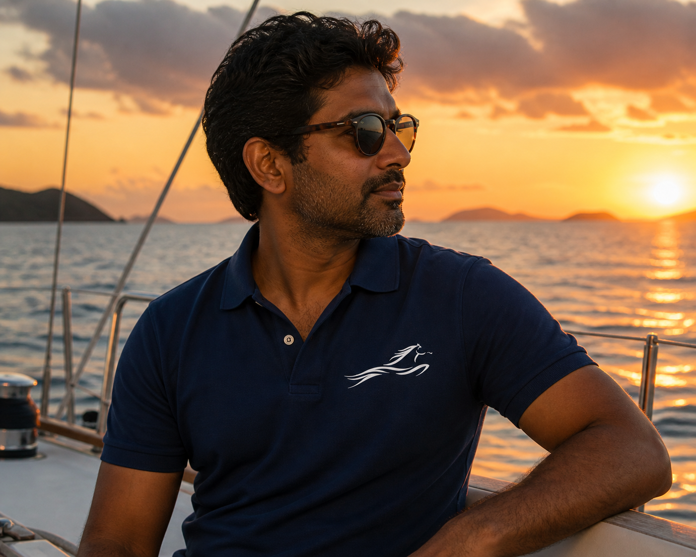
Embroidered polo designed for the onboard experience.
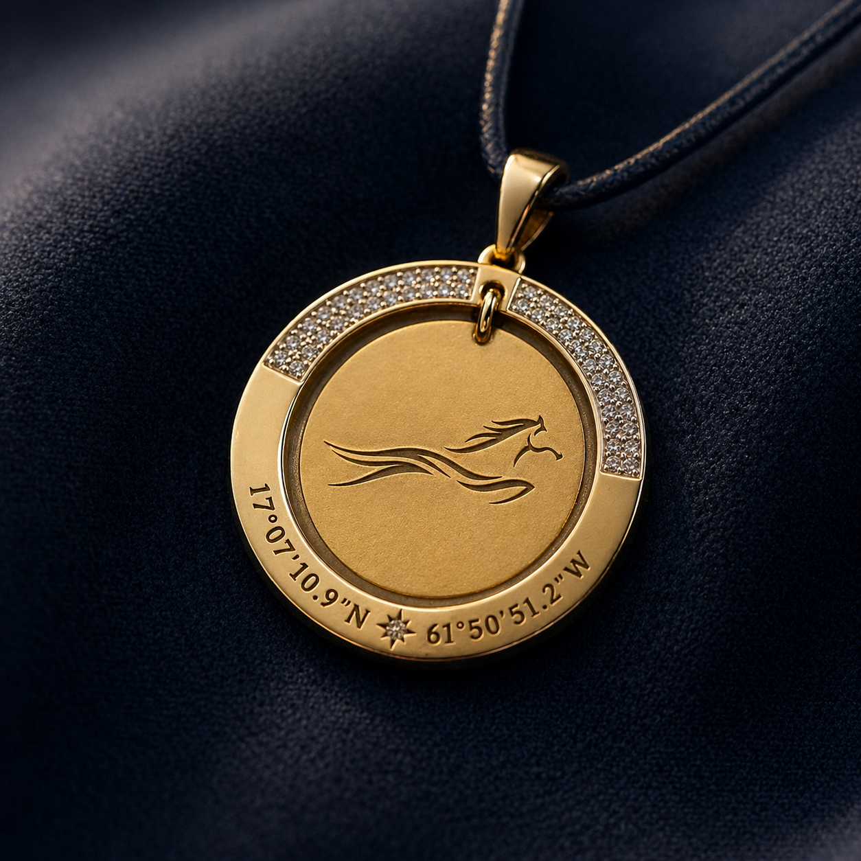
Commemorative pendant gift engraved with the HB51 symbol and coordinates.
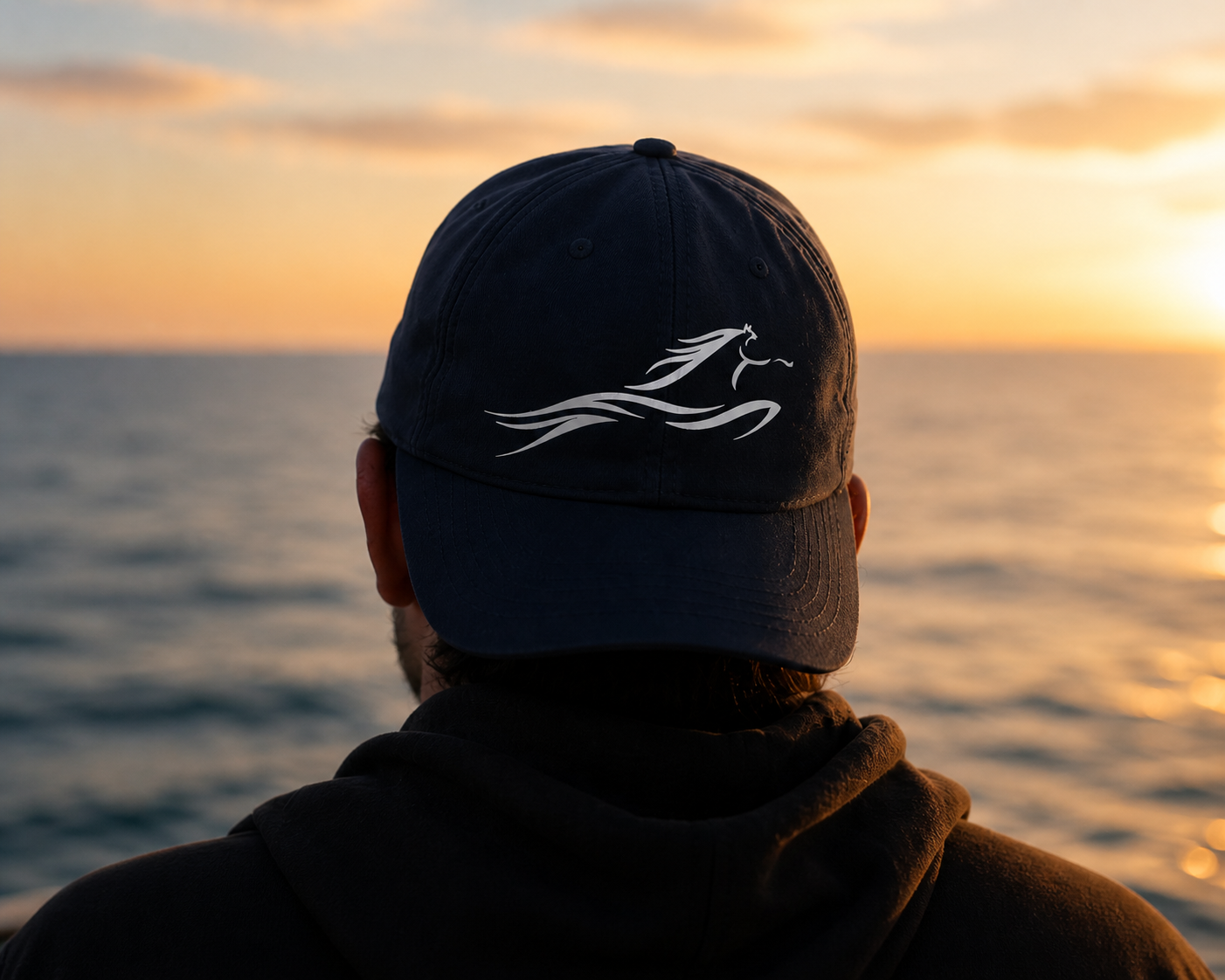
Custom navy cap extending the identity into wearable pieces.
THE BRIEF
The objective was to create a symbol that felt deeply personal without becoming literal or overly celebratory. Rather than designing a traditional birthday logo, the direction was to create something that represented movement, self-reflection, and transition.
The identity needed to feel elegant, timeless, and emotionally grounded while extending seamlessly across multiple touchpoints throughout the trip — including flags, postcards, apparel, projections, accessories, and printed materials.
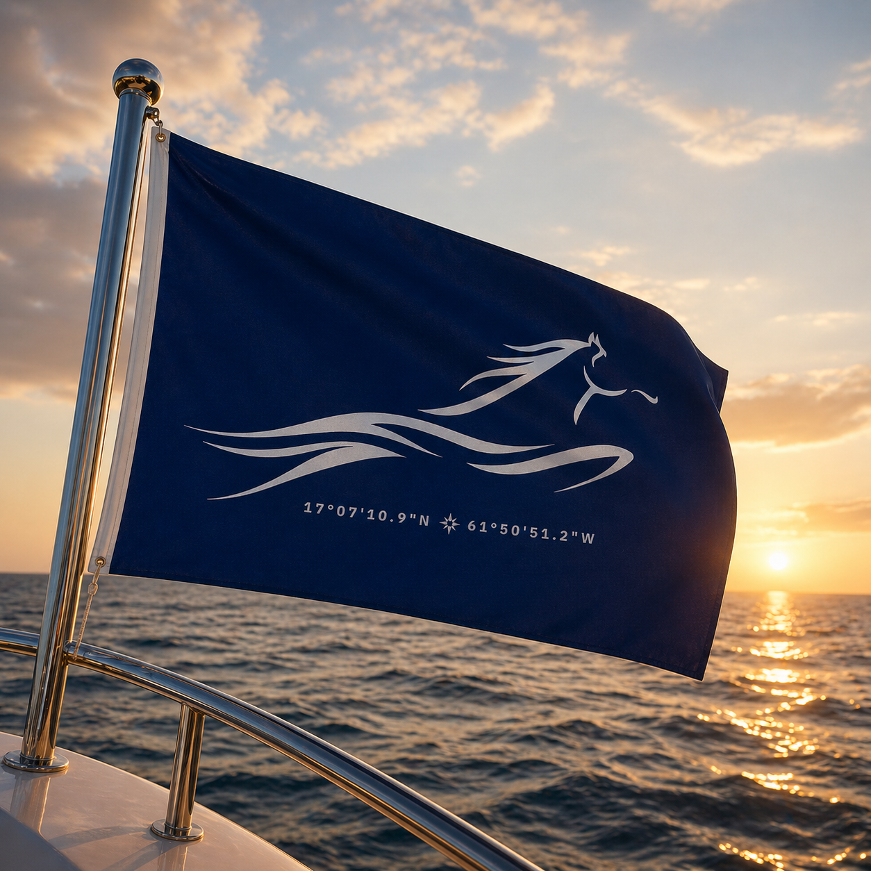
The celebration itself took place on water, which became an important contextual and emotional reference point within the design direction.
One of the biggest challenges was creating a symbol that carried emotional meaning without becoming too illustrative or overly literal. Finding the right balance between abstraction and clarity became an important part of the process.
Another challenge was ensuring the identity felt sophisticated across multiple applications while still maintaining the simplicity and strength of the original mark.
Because the symbol represented a deeply personal phase of life rather than a business or product, the approach required a more introspective and emotionally driven design process than a conventional branding project.

Luggage Tag
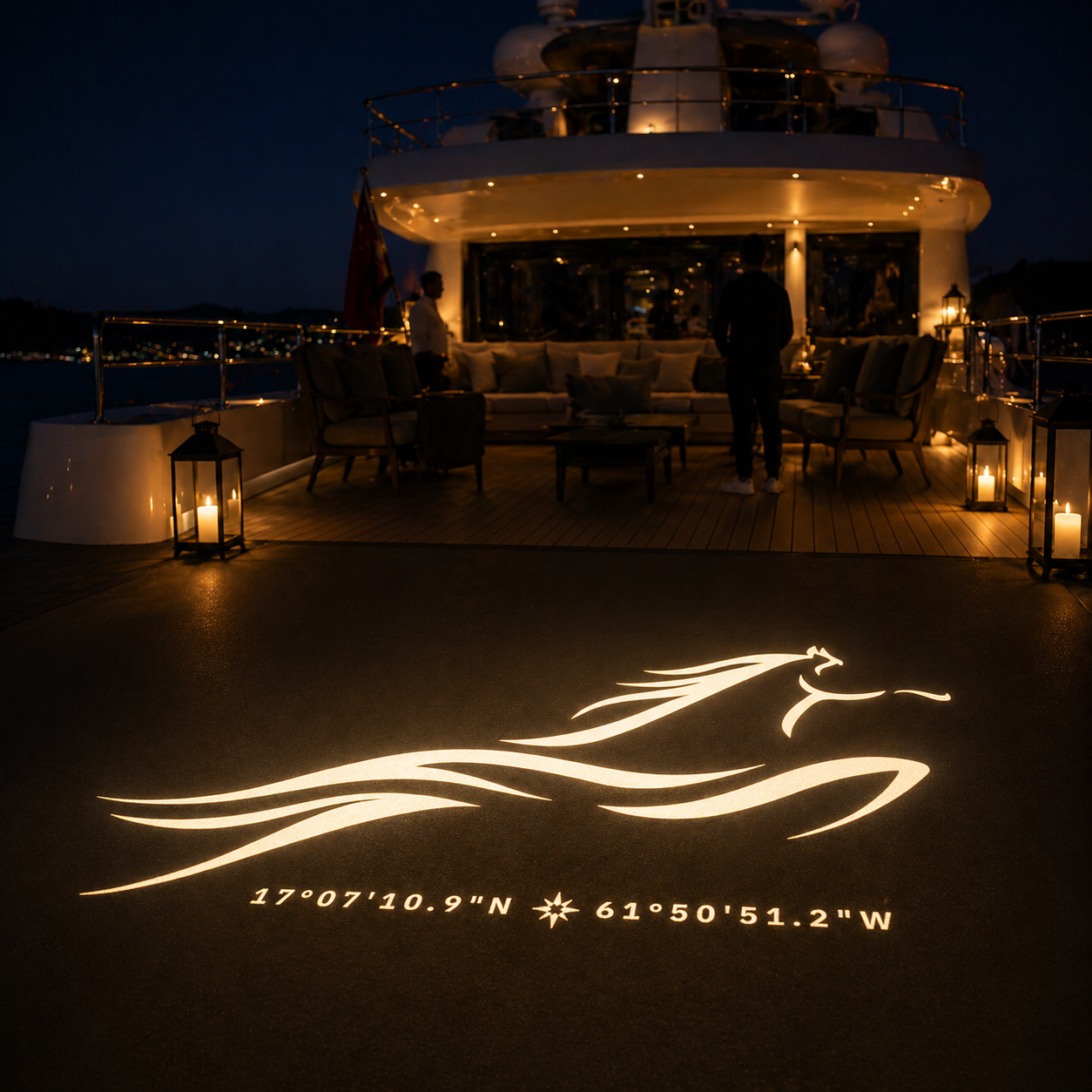
Gobo Projection
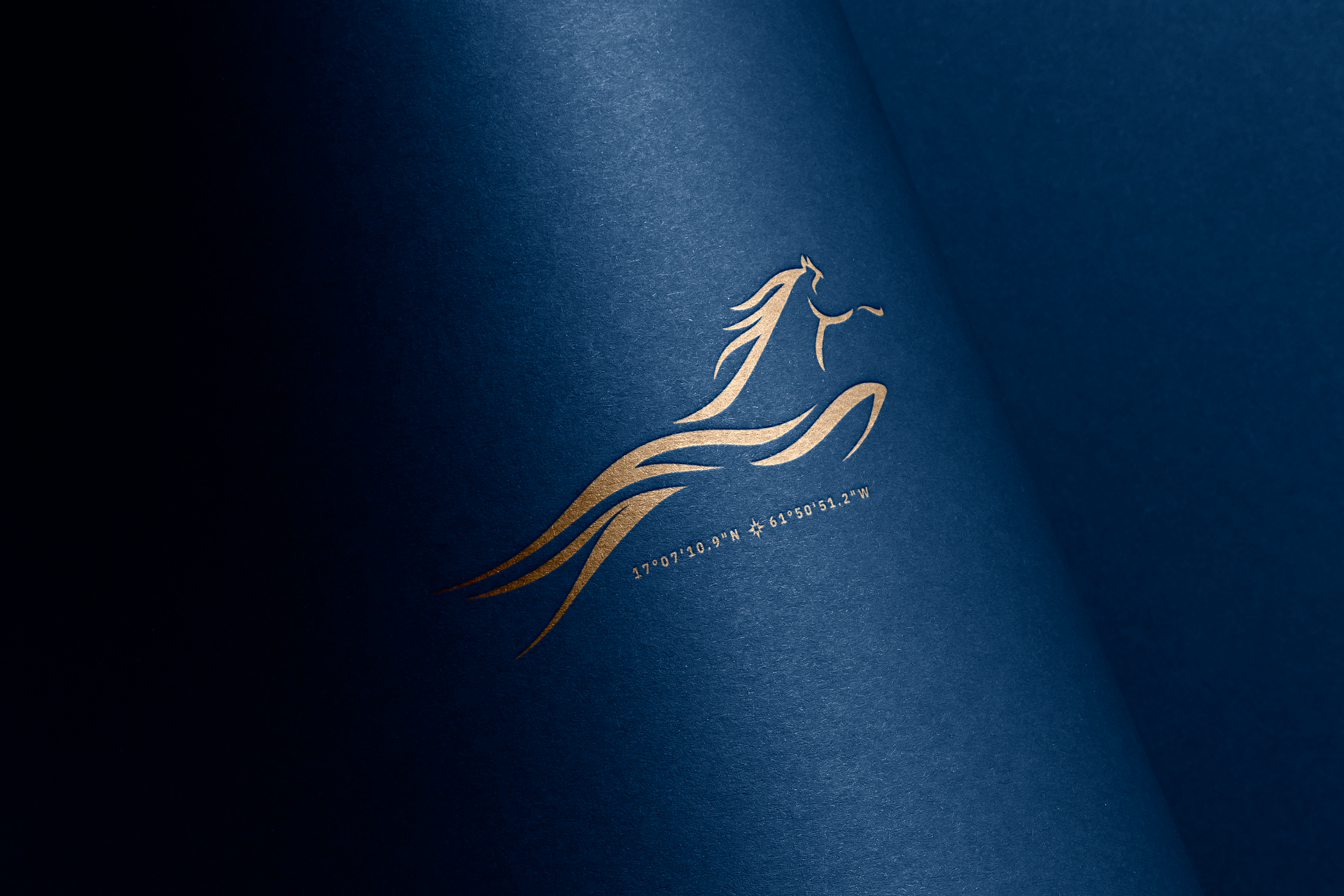
Foil Print
THE APPROACH
The design process began with a conversation around a question Haresh shared during our initial discussion:
"How do I want to show up in the next phase of my life?"
That thought became the conceptual foundation of the identity.
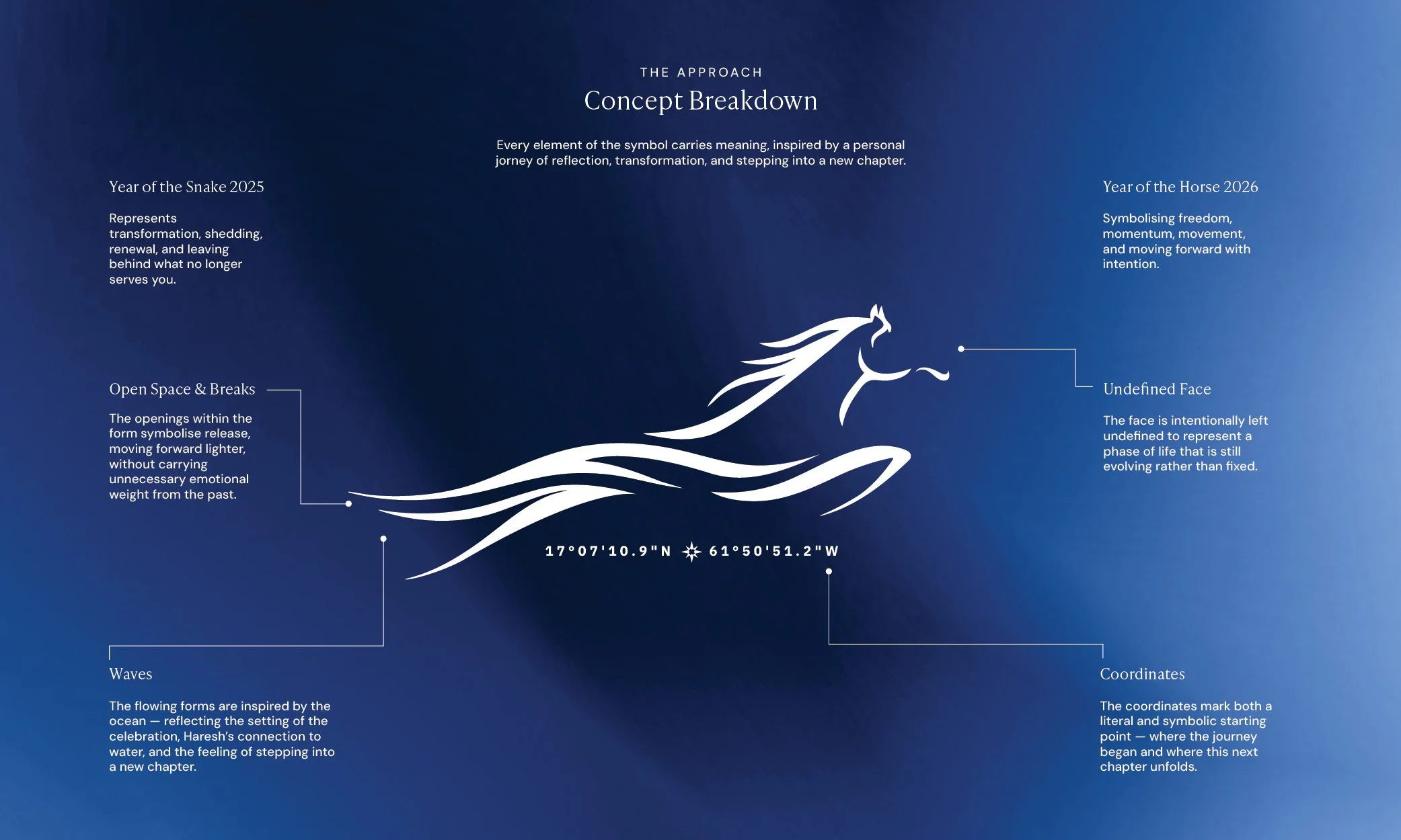
The past year has brought significant personal and professional change, uncertainty, and reflection. During the conceptual stage, I found myself drawn to the symbolism of the Year of the Snake (2025) — often associated with transformation, shedding, renewal, and leaving behind what no longer serves you.
That idea became an important layer within the symbol, reflecting a phase of life shaped by change, introspection, and transition.
The open spaces and breaks within the form represent release — almost like shedding skin — symbolising the process of moving forward without carrying unnecessary emotional weight from the past.
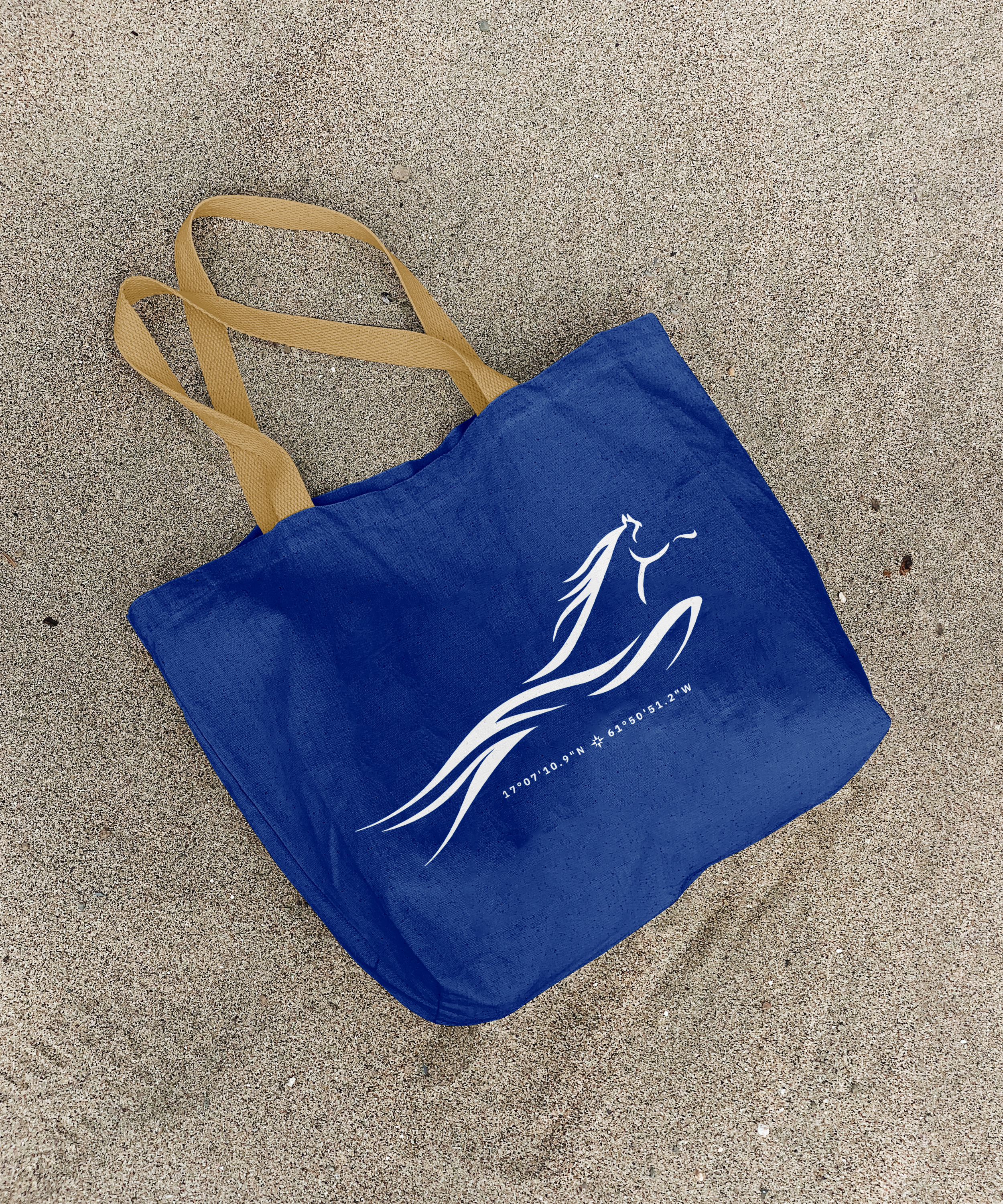
The final figure takes the form of a horse in motion, inspired by the symbolism of the Year of the Horse (2026) and its association with freedom, momentum, movement, and self-direction. Rather than appearing forceful or rushed, the horse was designed to feel calm, grounded, and already in motion.
Its body emerges fluidly from water, allowing the symbol to feel deeply connected to both the setting of the celebration and Haresh’s personal relationship with the ocean. Since the event itself took place surrounded by water, the flowing wave-like forms became an important part of the visual language — representing reflection, openness, movement, and the feeling of stepping into a new chapter.
The face was intentionally left undefined to represent a phase of life that is still evolving rather than fixed.
The coordinates embedded within the system mark both a literal and symbolic point of departure — the exact location where the journey began, and where this next phase of life quietly unfolds.
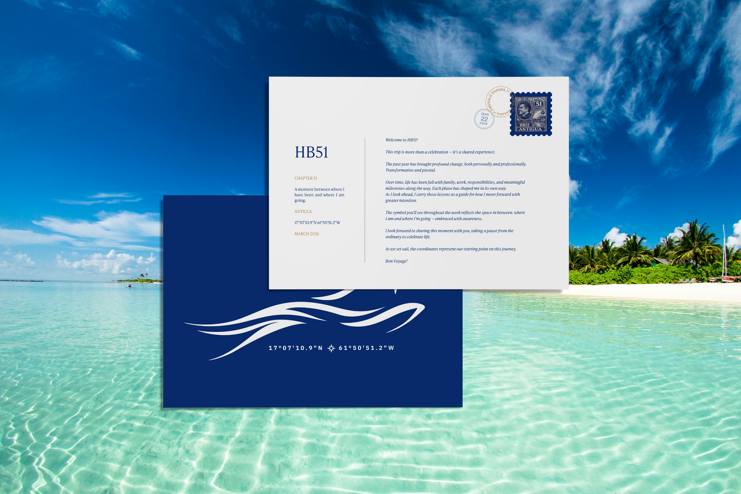
Welcome Note
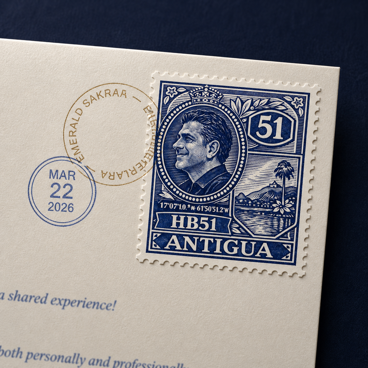
Welcome Stamp Post Design
THE OUTCOME
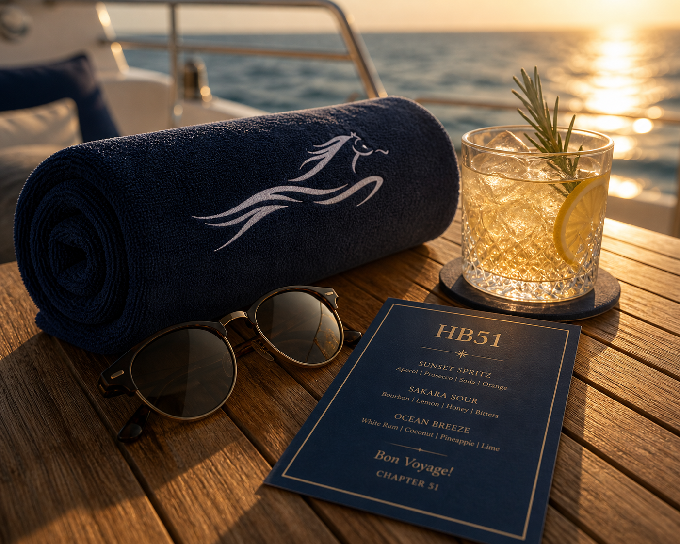
The final identity system extended across a wide range of physical and experiential applications throughout the celebration, including yacht flags, apparel, welcome stationery, projection graphics, embroidered accessories, travel elements, and a custom pendant personally gifted to Haresh.
Rather than functioning as a traditional event logo, the symbol became a shared visual thread woven throughout the entire experience, transforming the celebration into something more personal, immersive, and emotionally connected.
The result was an identity that felt both intimate and elevated — designed not simply to mark a birthday, but to represent a meaningful moment of transition.
Reel 1
Reel 2
“Still living the HB51 high…Shivani - You really captured the emotion.
Everyone felt it! Thank you is simply not enough. You nailed it!
Haresh Bhungalia
Credits
Branding By: Design By Shivani