
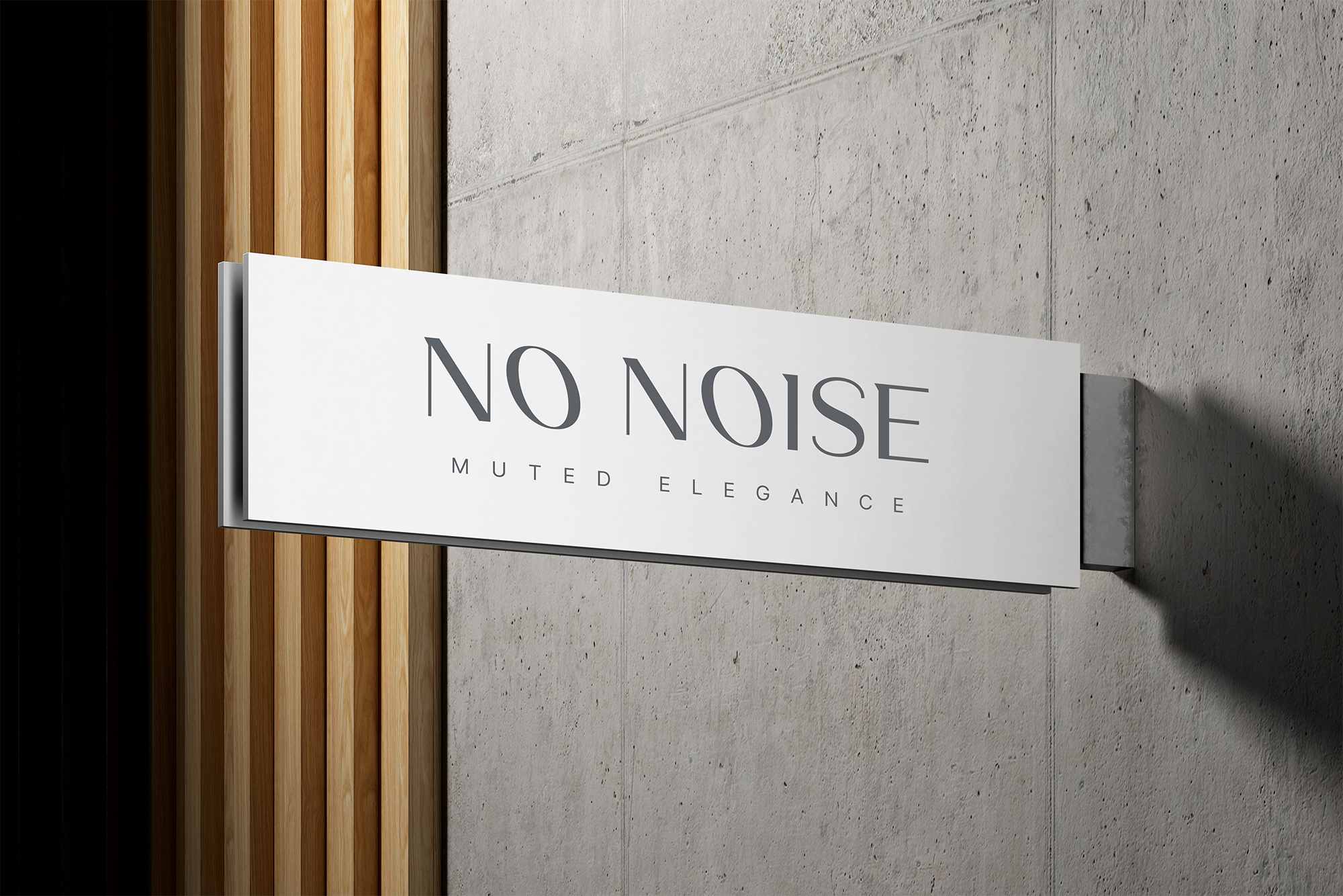
No Noise
VISUAL IDENTITY / PACKAGING ELEMENTS / CLOTHING TAGS / PRINT
THE CLIENT
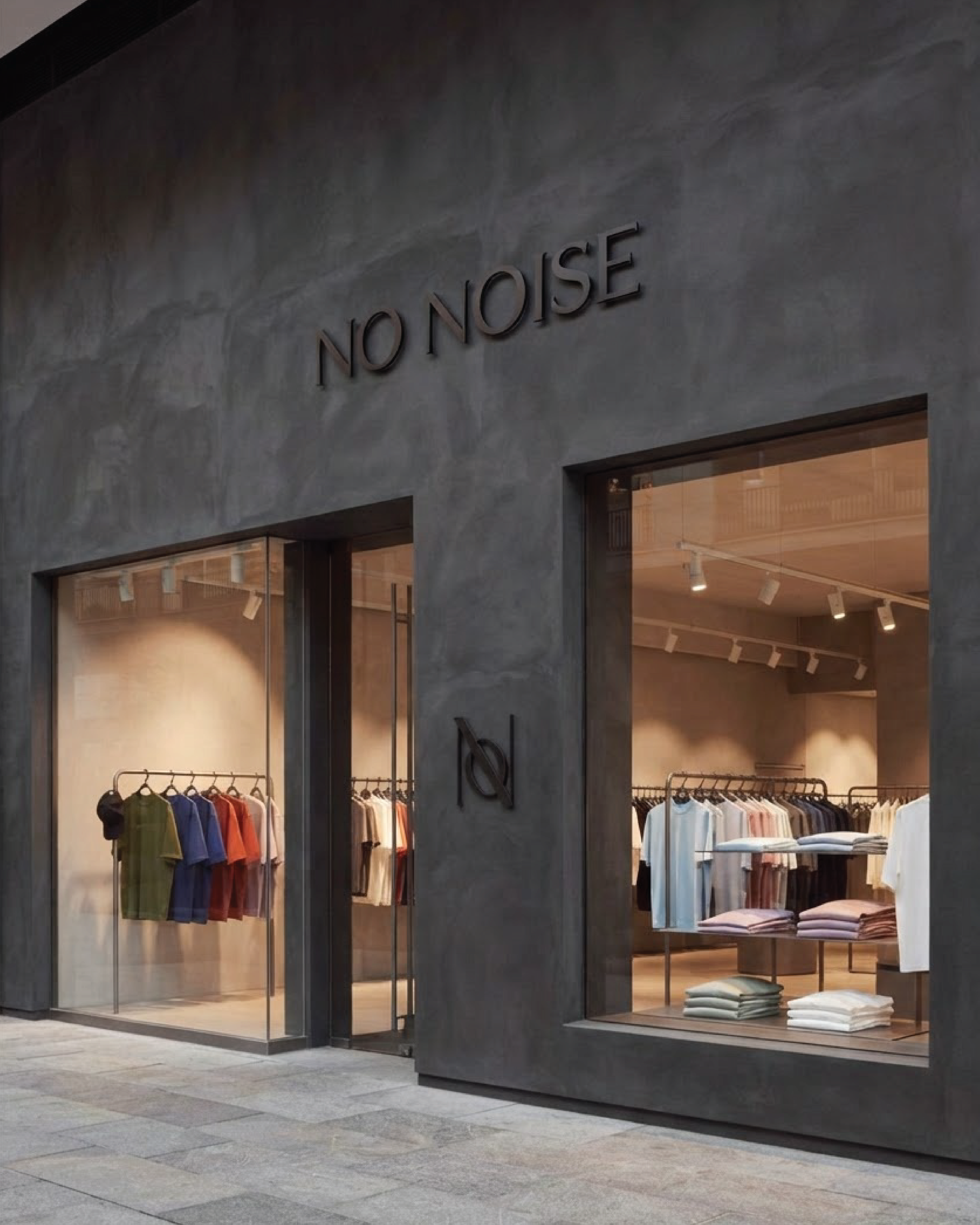
No Noise is a premium T-shirt brand for people who value quality, simplicity and pieces that feel effortless to wear.
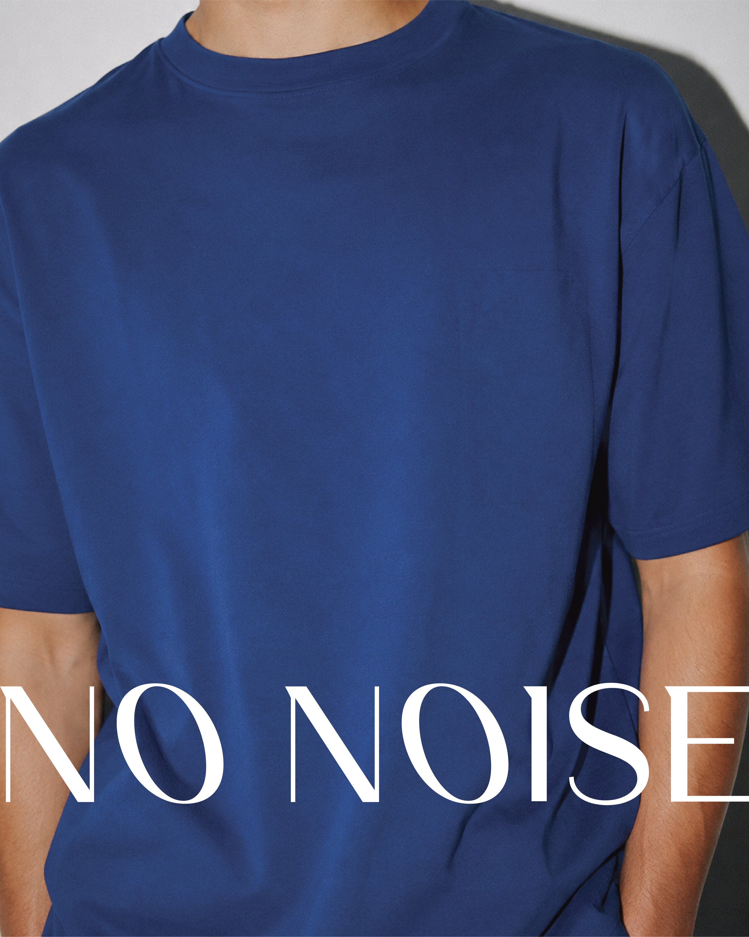
The name reflects a quieter approach to fashion, moving away from unnecessary logos, fleeting trends and visual distractions. The belief is simple: clothing doesn't need to compete for attention or define the person wearing it. Instead, it should create space for individuality, allowing the wearer to remain the focus.

THE BRIEF
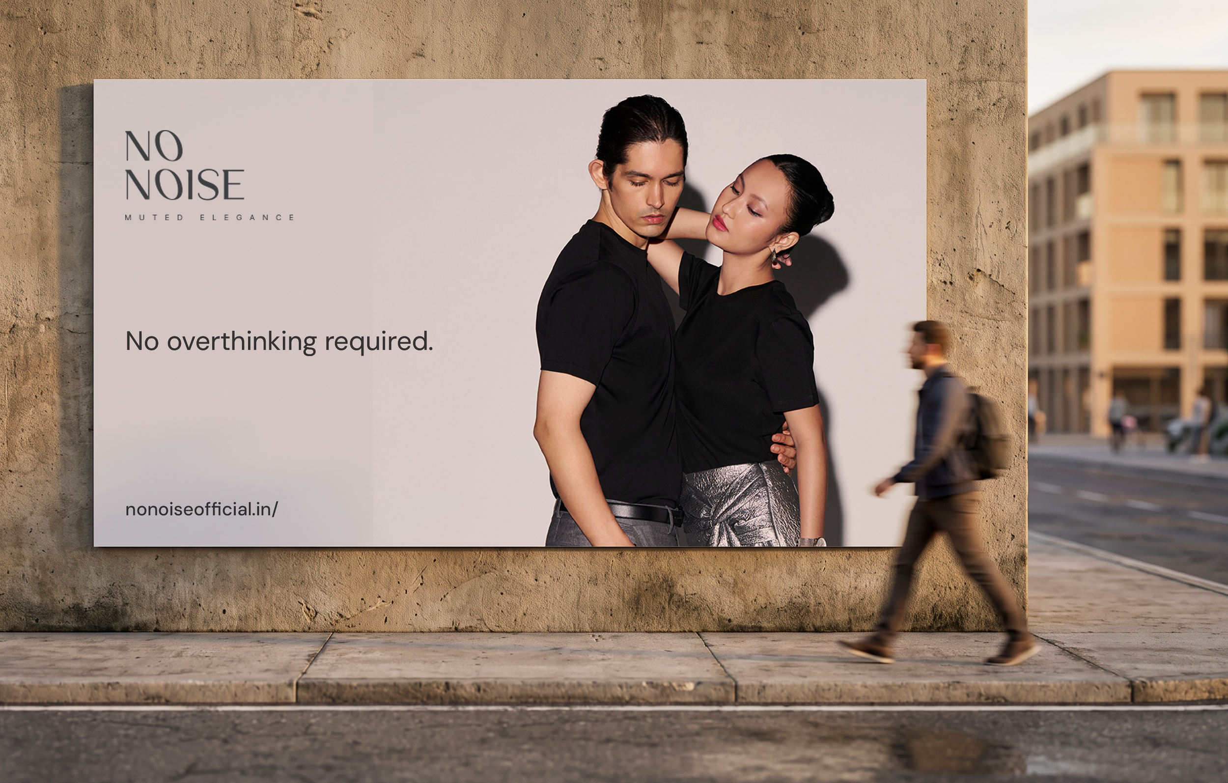
The brief was to create a distinctive identity that would appeal to men and women alike. The founder envisioned something timeless, refined and understated, yet with enough character to stand out in a crowded clothing market.
The identity needed to communicate quality and versatility while working consistently across garments, labels, packaging and digital platforms.
THE CHALLENGES
The challenge was to make simplicity feel distinctive. With T-shirts being one of the most familiar wardrobe staples, how could we create a brand that stood out without relying on loud graphics, oversized logos or conventional luxury cues?
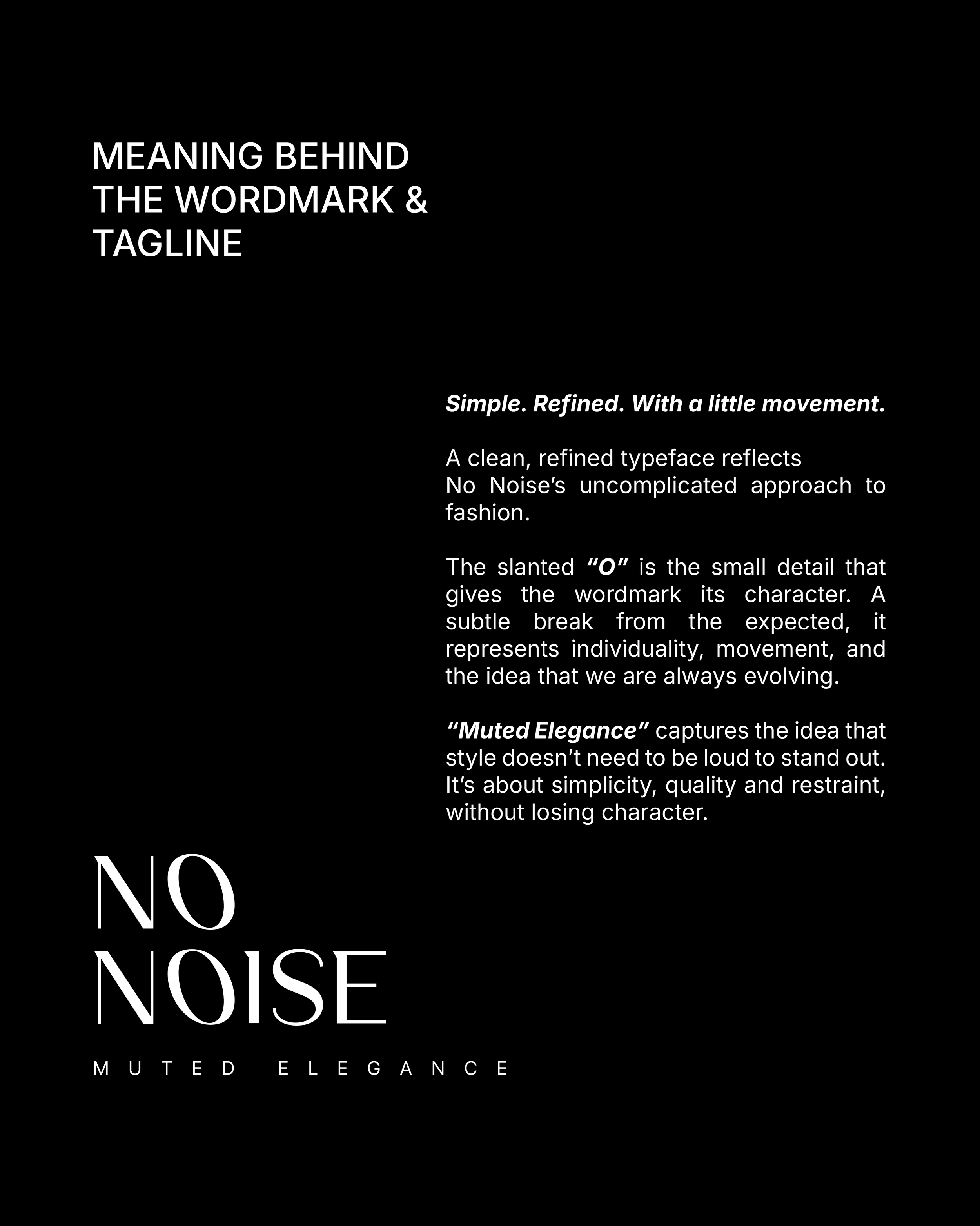
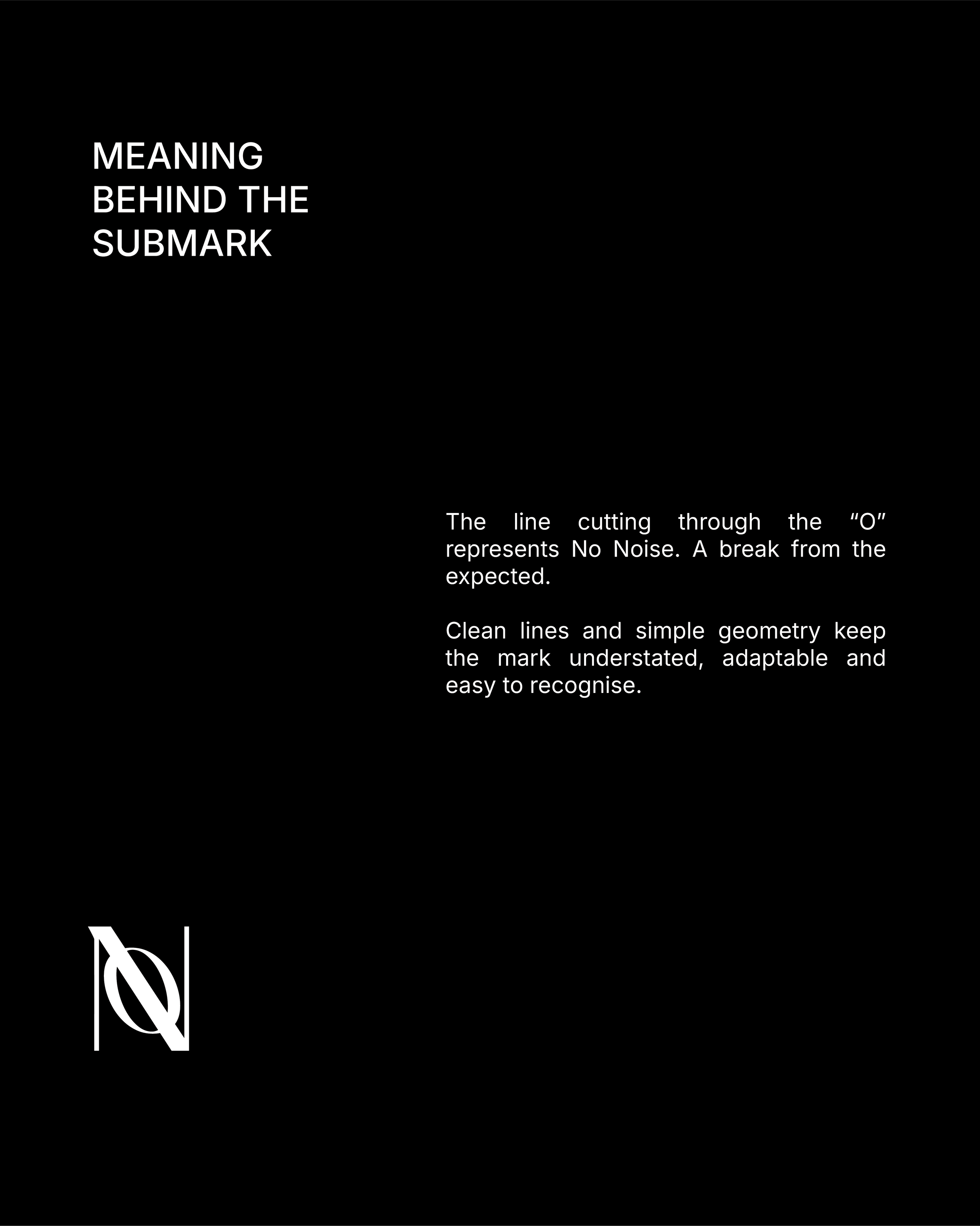
Another important part was bringing the name No Noise to life visually. The identity needed to reflect the name’s meaning while balancing simplicity with enough character to be memorable.
THE APPROACH
The approach was to let the brand's philosophy guide every design decision. We kept things minimal, clean and considered, avoiding unnecessary details or anything that felt overly decorative. From the choice of colours and typography to the garment labels, tags and packaging, every element was designed to feel purposeful and connected. The idea was to create an understated yet recognisable brand experience, where even the smallest details felt intentional.
The Design Process
Packaging Design Process
THE OUTCOME
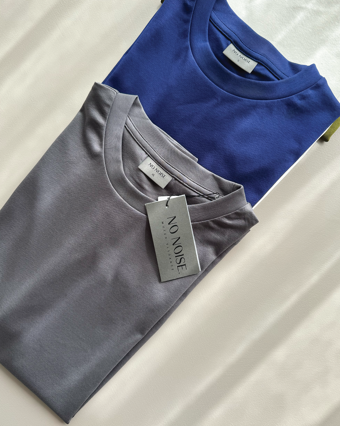
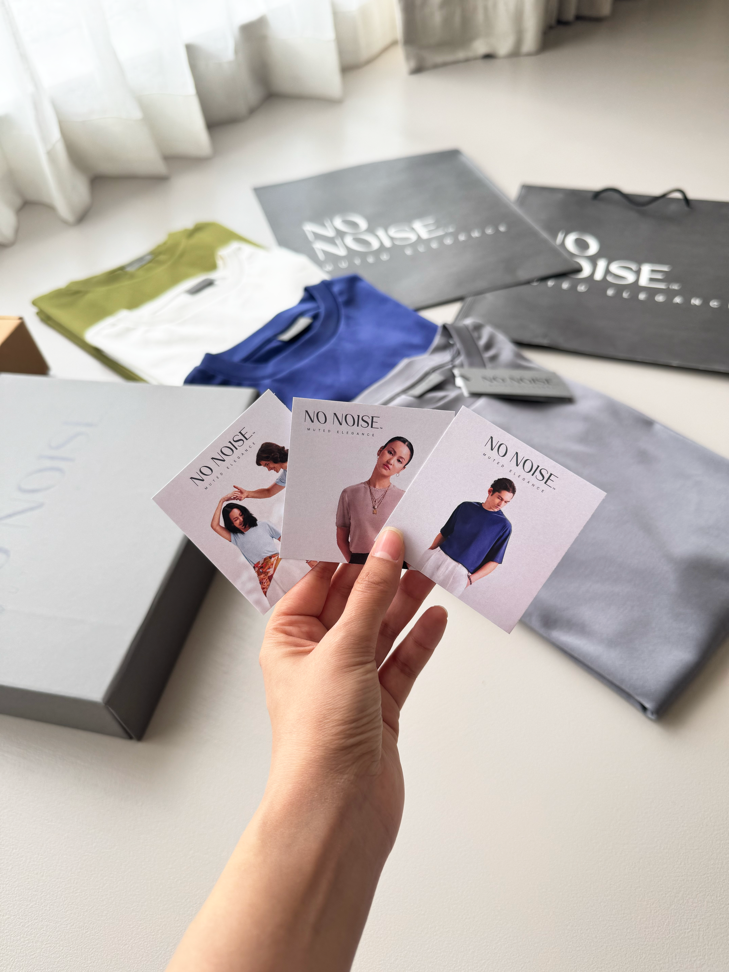
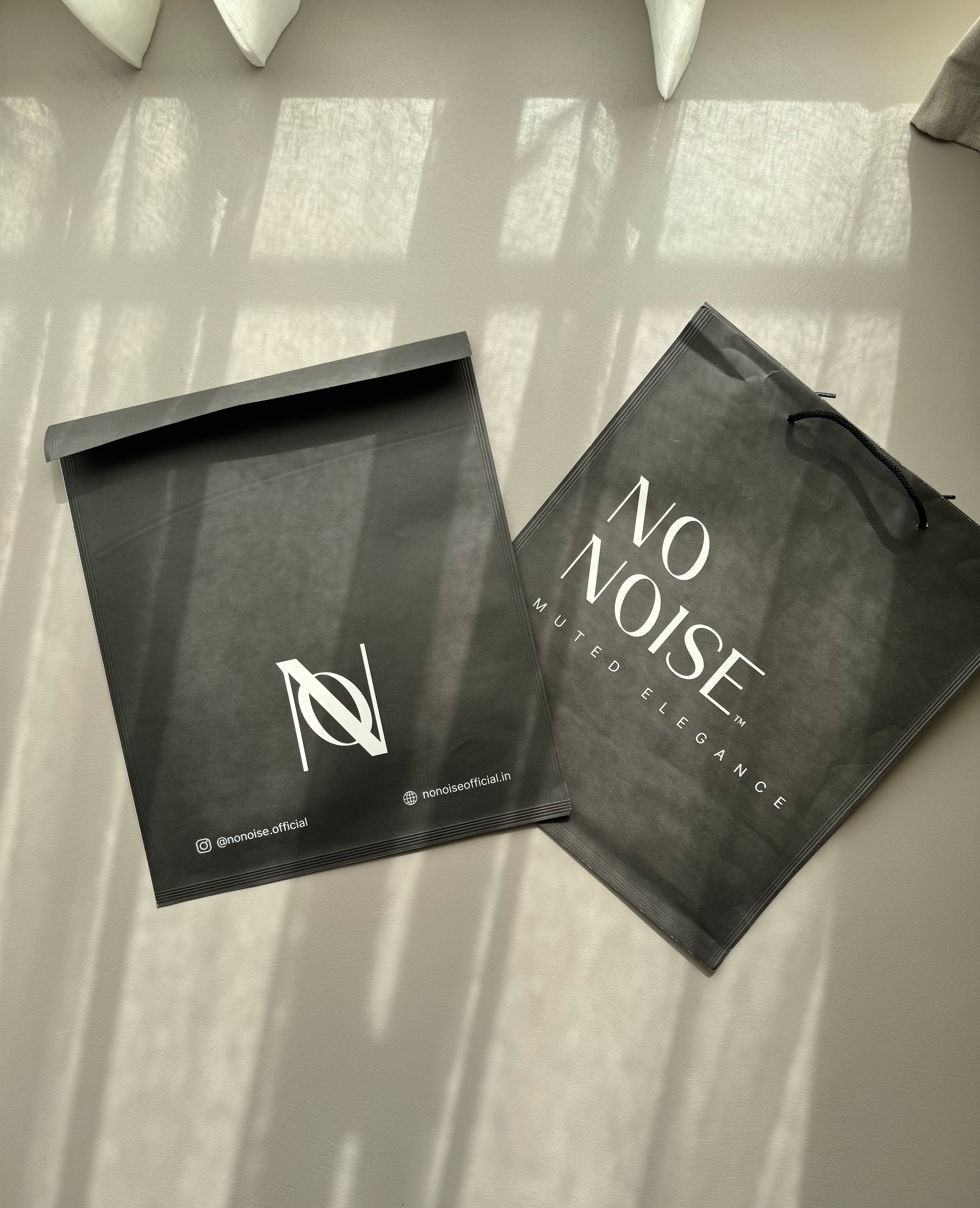
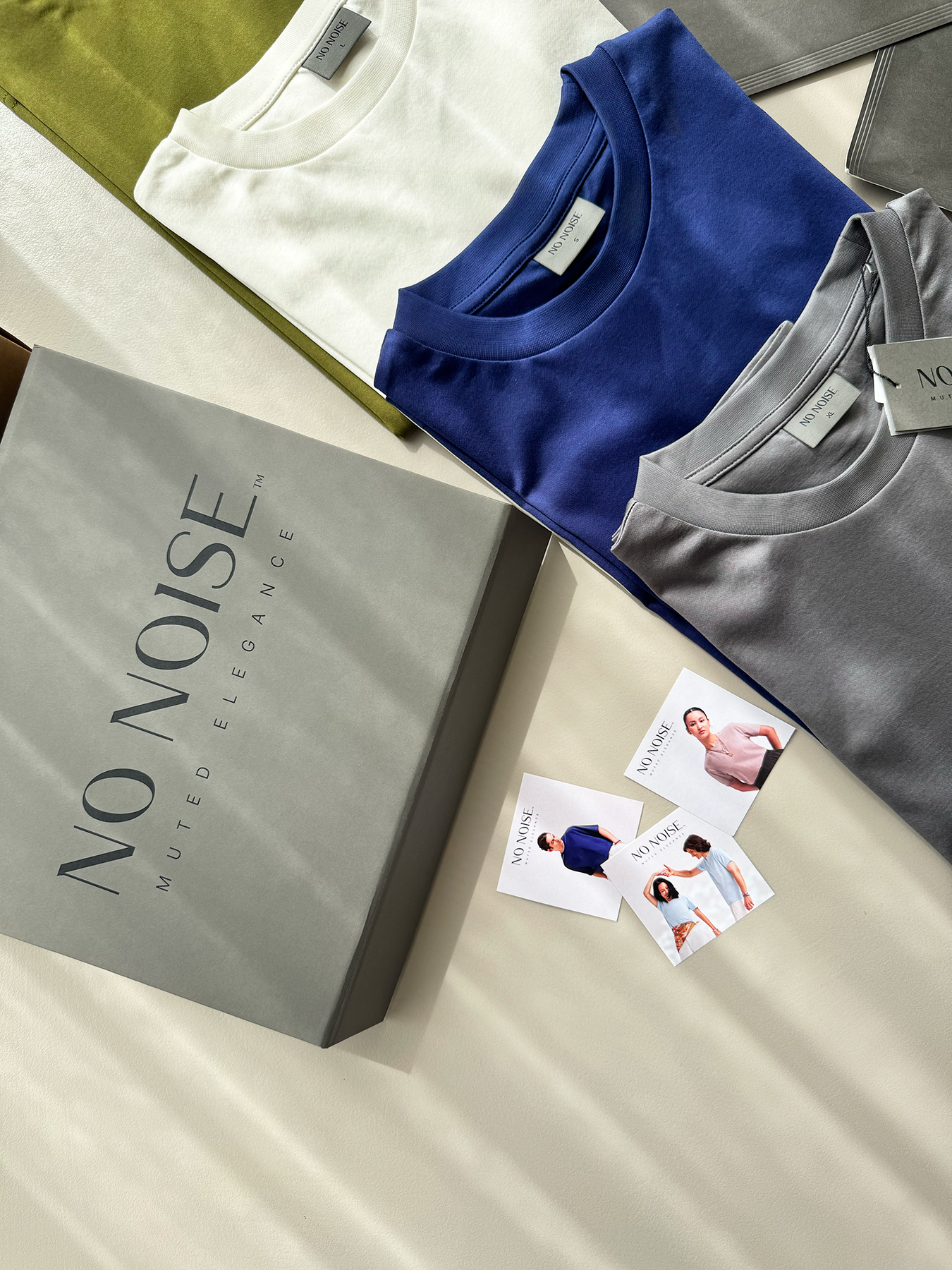
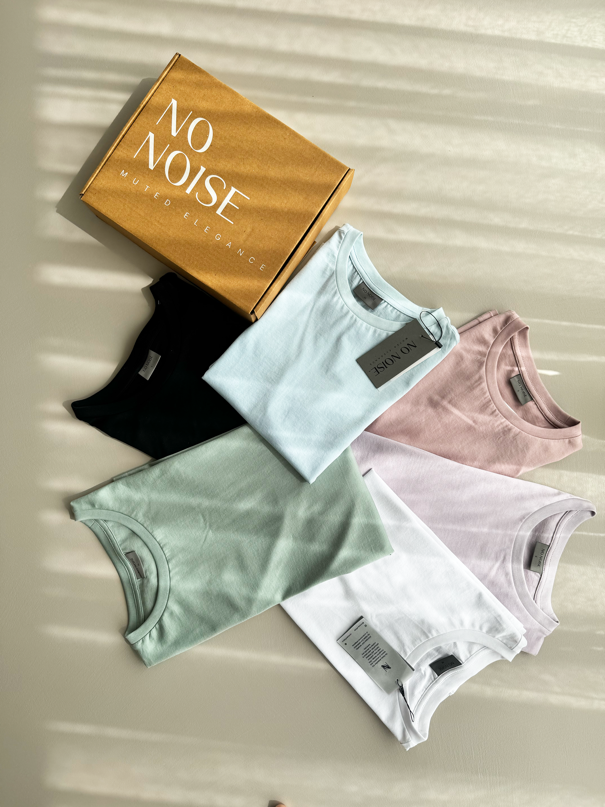
The final identity was extended across a complete packaging system, from paper tags and transparent clothing tags to garment labels and branded boxes. Each element was designed to carry the same understated look and feel, creating a consistent experience from the moment the customer receives the package to the moment they discover the garment.
Keeping the design clean and purposeful, we used thoughtful material choices, restrained typography and subtle brand details to bring the No Noise philosophy into every part of the unboxing experience.
“Working with Shivani was an amazing experience. She is extremely professional, and that really reflects in the quality of her work. What I particularly appreciated was how open she was to feedback and suggestions throughout the process. We explored different directions, revisited decisions, and even went back to rethink elements like the colour palette and typography until everything felt right. She was just as invested in getting the details right as I was, and I think that made all the difference. It was a genuinely collaborative experience, and I'm really happy with what we created together.”
Hiral Shah
Credits
Branding By: Design By Shivani