

Brand Refresh & Packaging Elements For Paeony
BRAND REFRESH / PACKAGING ELEMENTS / CLOTHING TAGS / PRINT
THE CLIENT
Paeony is a labour of love, meticulously crafted in India and brought to life by mother-daughter duo Maya Thakkar & Karishma Shah. Wanderers at heart, they often travel in search of inspiration and a sense of freedom. Their styles are not trend-driven but instead emerge as timeless pieces that can be paired as multiple ensembles.
At its heart, Paeony celebrates the simplicity of everyday life, creating clothing that feels effortless, versatile, and beautifully intentional.


THE BRIEF
When I began working with Paeony in 2022, the brand had only a logo. Karishma understood that a brand is far more than a symbol; it needs a story, a personality, and a system of design that ties everything together.
Paeony needed help to:
Build out brand guidelines and visual identity.
Design packaging and stationery that turned each order into an intentional experience.
Translate Paeony’s values of timelessness and sustainability into every touchpoint.

Brand Guidelines Design by Design By Shivani
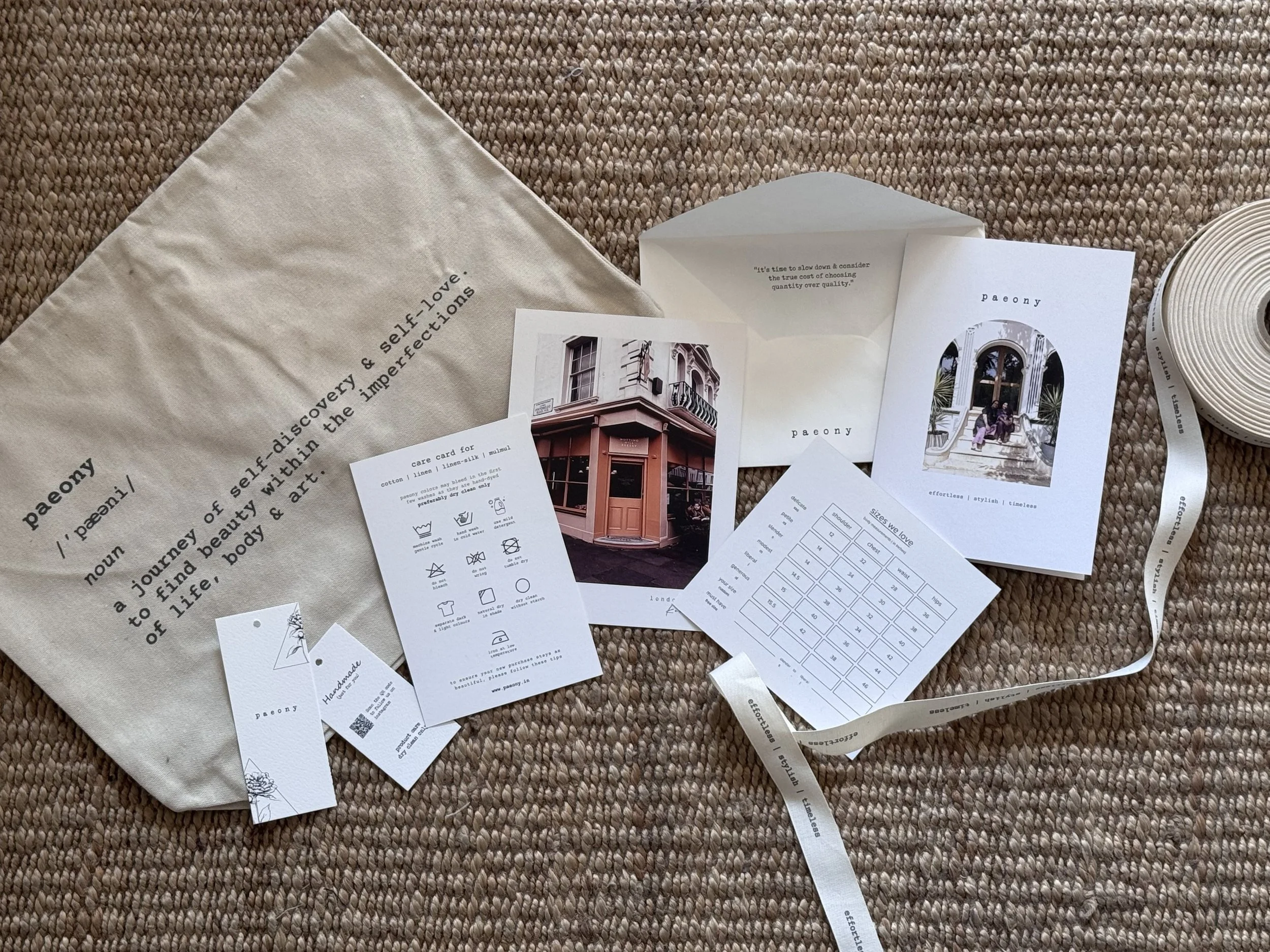
A thoughtfully curated system designed by Design by Shivani: including a reusable canvas envelope for clothing, custom hang tags, clothing labels, wash care cards, size charts, thank-you postcards, envelope design, shade card, and ribbon design.
THE CHALLENGES
The brand’s legacy and philosophy were rich, but lacked a structured design system.
Packaging was minimal, limited to a cotton tote with a bill inside an envelope and didn’t reflect the quality of the garments.
There was no consistency in visual language, making it difficult to communicate the brand story effectively online.
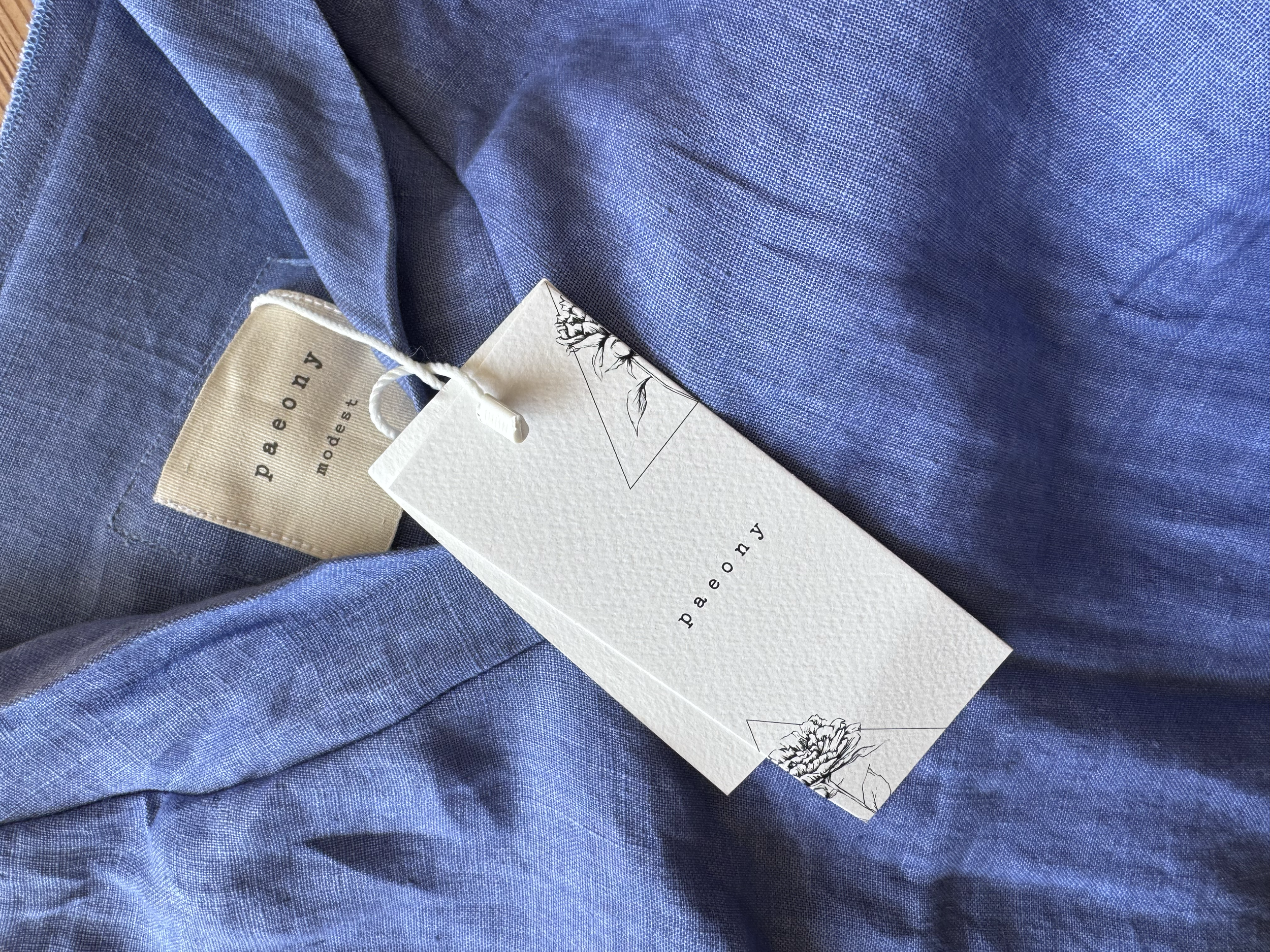


This collection brings together every detail designed to elevate the brand experience. From custom hang tags and clothing labels, thank-you postcards featuring the founder’s own travel photography, and a reusable canvas envelope inspired by Paeony’s philosophy of self-discovery and finding beauty in life’s imperfections. Each element is crafted to reflect the brand’s story, values, and timeless aesthetic.


THE APPROACH
Together, we:
Defined the brand vision, mission, and story to deepen meaning behind the name.
Created brand guidelines including a typography suite and neutral color palette that allowed clothing shades to take center stage.
Designed a cohesive set of packaging materials, from clothing tags, hang tags, thank you notes, custom ribbons and dear me journals.
Elevated the unboxing experience by introducing functional yet sustainable packaging that doubles as reusable storage.
Reimagined the sizing system, moving away from generic small-medium-large to meaningful names like “Delicate,” “Elegant,” and “Blissful.”

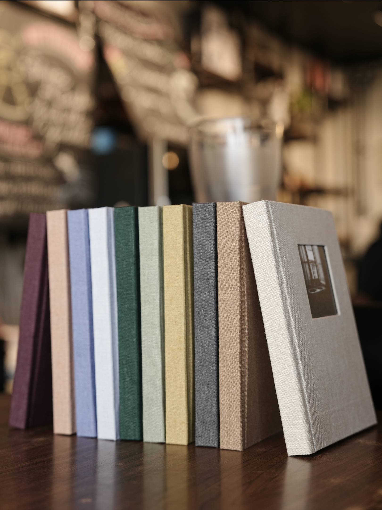


THE DEAR ME JOURNAL
As Paeony continued to grow, the founder conceptualized a new product; the Dear Me Journal, an extension of the “Dear Me” collection. My role was to translate this concept into a tangible design.
The journal was crafted using repurposed linen fabric, reflecting Paeony’s sustainability ethos. I focused on small but intentional details, designing the pages inside with reflective prompts and notes.
The outcome? A journal that feels like a love letter to yourself. A keepsake that holds dreams, reflections, and quiet thoughts. More than just stationery, it expands Paeony’s philosophy of mindful, timeless design into everyday living.
THE OUTCOME
The outcome is a brand identity that feels intentional, premium, and timeless, just like Paeony’s clothing. Every element, from packaging to printed collateral to the Dear Me journal, now carries the brand story and values forward. Customers no longer just receive a garment or product; they receive a meaningful experience that feels personal, thoughtful, and lasting.
“Shivani has an incredible eye for design and aesthetics. I loved her holistic approach and the way she truly listened to what I was looking for, then translated it into design so effortlessly. She understood Paeony’s language and carried it forward in our packaging while adding much more than I had expected.
Her design sense is classy, sensible, and sensitive, with a rare emotional touch that makes the work feel personal. Throughout the process, she was patient, communicative, and always approachable.
What I appreciate most is that she doesn’t treat projects as just professional work; she pours herself into them as if they’re her own. From understanding the brief to research, designing, sampling, and pushing us to try new ideas, she gave her best till the very end.
I don’t think anyone else could have translated my vision as beautifully as she did. I’d recommend Shivani to anyone looking for branding, packaging, or design that goes beyond expectations.”
Karishma Shah
Credits
Branding & Packaging Design: Design By Shivani